Monday, 29 November 2010
My own Poster
Poster Analysis:
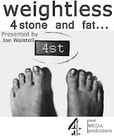
The title is weightless, in "Tahoma" font this has been chosen because its easy to read, bold and serious. I tried to keep the layout simple and uncluttered so people wouldn’t have to spend to long reading it. I made some things bigger than others in value of their importance, so institutional references and the title I made the largest and the tag line I made smaller. The tag line is “4stone and fat” we chose this because the weight is shockingly low and no one who is 4 stone could possibly be fat, we felt it shows the psyche of eating disorder sufferers well and with great realism.
Poster drafting:
We wanted our poster to be shocking, to reflect the documentaries subject of eating disorders. we wanted it to make people stop, and think. The purpose of the poster was to surprise people and show them what an important issue eating disorders can be and then to hopeful interest people enough so they will watch the documentary.
Firstly we wanted our main image to be of a severely thin person to show people how serious eating disorders can be. Although we needed to take the picture and we didn’t know anyone who was that ill with a disorder. We then thought about photographing a delicious plate of food with a tag line saying is this scary… or something to that effect. We thought although it would be easy to do it wouldn’t be shocking enough to grab peoples attention.
Then I thought of photographing someone standing on scales, I photo shopped the number to make it really low. I chose black and white because I felt it made the poster more serious but kept it looking simplistic which I think is important for a poster. The main image was taken by me, and then photo shopped. I turned it black and white and changed the lighting and contrast to make the image more raw. And I lastly added typography saying the information we needed it to contain.
 |
| Origial Picture we wanted to use from google images. |
 |
| This is what it looked like after being photo shopped and made to look like a poster. |
Images of my poster at various stages of production.
 |
| Original Photo taken by me. |
 |
| Image made black and white. |
 |
| With upped contrast and 4 logo. |
 |
| Tinted blue. |
 |
| Contrast upped and lighting altered. |
 |
| Lighting and contrast changed. |
 |
| More info added and image lengthened. |
 |
| Only the top part lengthened. |
 |
| Picture cropped and turned to landscape. |
 |
| Image lengthened clearly showing parts of high importance. |
 |
| This was going to be our final poster but then i improved it further. |
 |
| This is the final poster. with presenter centred and feet further down the page and intiuitional ref. made smaller. |
Subscribe to:
Comments (Atom)
